Rubino: A new graphic design for Torre Testa Rosato
An innovative restyling that recalls the same unmistakable brushstroke of the Torre Testa Rosso label: an iconic wine that highlights the distinctive uniqueness of the Susumaniello Rebirth Project, carried out by the Rubino company for 25 years.
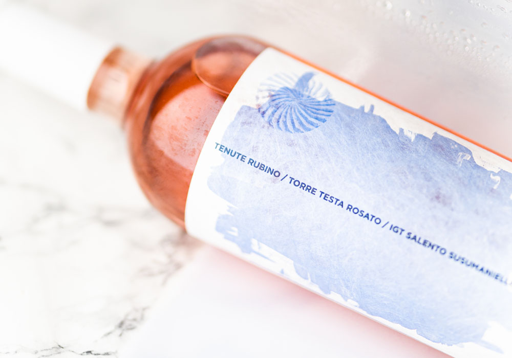
The concept of the new label is the result of “artisanal knowledge” and manual skills that unite the world of wine and art. Just the call to the creativity of art is put on display through the same “brush stroke” of color that constitutes the distinctive element recognized on the bottles of the Torre Testa decorated. That blood red recalls the colored print of the fingertips, resulting from long days of harvesting Susumaniello. The ancient variety allows for an eclectic production: from super reds for aging to other fresher and more contemporary versions as well as beautiful rosé wines, where elegance meets power much like many traditional rosé wines of the region.
In the creation of the new packaging of Torre Testa Rosato, there is a clear reference to the transparency and gloss of this unusual rose, clearly less intense in color (certainly due to the reduction in skin contact) but also the silkiness – precious and fascinating – that’s pleasant on the palate, leading to a very particular minerality. This is a Puglian rosé of rank – it’s distinctive on the palate and at the top of Tenute Rubino’s wine production. A high-quality wine – both in its taste, packaging and color – the stylistic choice of the discoloration is effective and plays with the recall to distinctive elements adopted by the Torre Testa Rosso label. “There is a shared narrative that links this wine to the prestige of the historic Torre Testa,” explains Romina Leopardi, Head of Marketing and Communication of the company from Brindisi. “The restyling was necessary in order to reflect a coherence in style that’s critical in helping Rubino express its values of identity and imagination”. The winery was careful in the choice of paper used – one that is less compact – in order to incorporate light into the wine through the glass of the bottle. This radiance is symbolic of that expressed in the terroir of Jaddico (the prince of Rubino’s estate in the north of Brindisi). Here you find sandy, deep lands, lying on the Adriatic front, open to the sea. A continuous ventilation and an aerosol effect nebulizes in the sea water air. This aspect is also represented in the label and in the chromatic play exerted on the surface, as if to reproduce the formation of salt crystals.
“The restyling of the new Torre Testa Rosato label is the result of a collaboration,” – concludes Romina Leopardi – who involved Atelier 790, a graphic design studio in Palermo and historical partner of the company. “We are really satisfied and I think that the new packaging enhances the aesthetic appeal of this important bottle, improving its perception even outside national borders”.
After the Red Head Tower and the work Flower People by Dino Sambiasi, whose canvas has been replicated on the label of Palombara, the Rubino family further consolidated the link between wine and art in Brindisi. The new Torre Testa Rosato project is in fact a further step in the process of the company highlighting affirmation art, which began in 2020.